|
|
Post by hup123hup123slapslap on Feb 24, 2014 3:51:19 GMT
Hey everyone! We're gonna formalize the font that everybody uses for their cards. We don't have the text picked out yet, so please do add in your input below! When we have a few I'll put them in a poll and you can vote for your favorite!
Remember:
-The font must be free so that everyone can use it! If it's a regular font, or from dafont or another such site, that's fine.
-If the font is downloaded, check to see that it can be used for this purpose! Because the end goal is to sell these cards, the font has to be available for commercial use.
-Must be legible, obviously.
Go at it, folks! We'd love to have your input on this before we make a decision.
|
|
|
|
Post by blatrus on Feb 24, 2014 5:20:12 GMT
Also PLEASE keep in mind that certain custom typefaces are not always made for print in mind. Before we do finalize anything, I would suggest doing test prints of said typefaces to see what works and what doesn't. Web vs Print typefaces have their own pros and cons so please be aware of that when suggesting one for use.:3
|
|
|
|
Post by thewaywardqueen on Feb 24, 2014 11:08:51 GMT
I'm boring but i like good old Calibri because its clear but it's not the prettiest.
|
|
|
|
Post by blatrus on Feb 24, 2014 19:13:42 GMT
I'm boring but i like good old Calibri because its clear but it's not the prettiest. I would agree with that since it's a Sans Serif so it's made for easy readability. Ugly, a little but it works.xD Adding it to the list though so we have options in case of things not working out.:3 |
|
shadymason
New Member
 Last visited dec 8,2019
Posts: 11
|
Post by shadymason on Mar 7, 2014 4:18:53 GMT
(excuse me as I make my rounds I may or may not be trying to become the most active member) Here is a website we use at my school a lot for projects and such, not to mention all the fonts are free to download. I'll do some digging and see if I can find some good ones! EDIT: Here are a few fonts that I liked but you may take your pick or choose something else: Last King Quest (bold, not over the top) Selfish (Capitals are decorative but you can still read them) BreastBomb (bold, again capitals are decorative not the easiest to read out of this list) JB Elegant (Simple and the easiest to read but is the thinnest of them all) |
|
shadymason
New Member
Last visited dec 8,2019
Posts: 11
|
Post by shadymason on Mar 7, 2014 4:46:18 GMT
Oh I'm dumb. You may have to contact some people about some of the fonts but I don't think I'll be a problem
|
|
|
|
Post by hup123hup123slapslap on Mar 10, 2014 20:38:51 GMT
(excuse me as I make my rounds I may or may not be trying to become the most active member) Here is a website we use at my school a lot for projects and such, not to mention all the fonts are free to download. I'll do some digging and see if I can find some good ones! EDIT: Here are a few fonts that I liked but you may take your pick or choose something else: Last King Quest (bold, not over the top) Selfish (Capitals are decorative but you can still read them) BreastBomb (bold, again capitals are decorative not the easiest to read out of this list) JB Elegant (Simple and the easiest to read but is the thinnest of them all) That's really appreciated we love active membersThanks! Those fonts are noted. |
|
|
|
Post by bacoose on Mar 11, 2014 9:44:55 GMT
Here's a website that lets you turn your handwriting into a font that you can download. 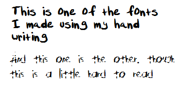 Its pretty simple, just download the template, then write the letters in upper and lower case, then a few numbers and symbols and you're ready to go.
|
|
|
|
Post by yozpinmerightround on Mar 11, 2014 12:35:27 GMT
Or we could all use different fonts and that's fine, as long as they're legible, available for commercial use and okay to print... ? I don't know, I just find that using the same font on all of the cards would look boring.
|
|
|
|
Post by hup123hup123slapslap on Mar 11, 2014 16:35:25 GMT
Here's a website that lets you turn your handwriting into a font that you can download. Its pretty simple, just download the template, then write the letters in upper and lower case, then a few numbers and symbols and you're ready to go. Oh cool! Thanks! Everybody is totally free to use this to submit fonts  |
|
|
|
Post by hup123hup123slapslap on Mar 11, 2014 16:38:39 GMT
Or we could all use different fonts and that's fine, as long as they're legible, available for commercial use and okay to print... ? I don't know, I just find that using the same font on all of the cards would look boring. Originally I thought the same but a few people have proposed using the same font and I agree that it would create unity. With so many different art styles and such, I think unity is gonna be pretty important with this deck in the ways we can find it. There are currently almost 40 artists, so with everybody using different fonts it might get a bit hectic and seem really disconnected, you know what I mean? It just seems to make sense that we'd at least have unity in the font and card backs, whereas everything else is totally free game in terms of artistic expression. |
|
|
|
Post by yozpinmerightround on Mar 11, 2014 20:35:33 GMT
Originally I thought the same but a few people have proposed using the same font and I agree that it would create unity. With so many different art styles and such, I think unity is gonna be pretty important with this deck in the ways we can find it. There are currently almost 40 artists, so with everybody using different fonts it might get a bit hectic and seem really disconnected, you know what I mean? It just seems to make sense that we'd at least have unity in the font and card backs, whereas everything else is totally free game in terms of artistic expression. Hmmm, you're actually quite right about the need of 'unity'. I'm assuming this also implies an agreement on the font's size, colour, and whether or not we can "decorate" it (borders, colour gradients,...) then? As for suggestions, my first picks would be some really boring and generic fonts like Times New Roman and Georgia. Not particularly fancy, but I could see a deck of tarot cards use a similar font. Imperator looks slightly prettier, and it includes several font files. apologies if my suggestions aren't very original h e h
|
|
|
|
Post by hup123hup123slapslap on Mar 12, 2014 16:24:03 GMT
Originally I thought the same but a few people have proposed using the same font and I agree that it would create unity. With so many different art styles and such, I think unity is gonna be pretty important with this deck in the ways we can find it. There are currently almost 40 artists, so with everybody using different fonts it might get a bit hectic and seem really disconnected, you know what I mean? It just seems to make sense that we'd at least have unity in the font and card backs, whereas everything else is totally free game in terms of artistic expression. Hmmm, you're actually quite right about the need of 'unity'. I'm assuming this also implies an agreement on the font's size, colour, and whether or not we can "decorate" it (borders, colour gradients,...) then? As for suggestions, my first picks would be some really boring and generic fonts like Times New Roman and Georgia. Not particularly fancy, but I could see a deck of tarot cards use a similar font. Imperator looks slightly prettier, and it includes several font files. apologies if my suggestions aren't very original h e h
The color and look will have to be the same, yeah. And noted!! I also totally love the Imperator fonts, they're lovely. |
|
|
|
Post by achievementhunt-her on Mar 17, 2014 15:42:41 GMT
Upon doing some research, I found out that this is actually the font that roosterteeth uses: www.ufonts.com/fonts/metaplus-black.html I was thinking it would be a cool shout out if we used this, but then again it's pretty thick, so it may look cramped on the cards. I don't know, just my two cents. ^w^ |
|
|
|
Post by cadidave on Mar 19, 2014 19:05:51 GMT
I love both Imperator and Last King Quest. I think Last King Quest would be a bit better though? It flows and has different line widths which look really nice uwu
|
|


