shadymason
New Member
 Last visited dec 8,2019
Posts: 11
|
Post by shadymason on Mar 5, 2014 1:49:18 GMT
Here is my design so far. this is in the middle of lining it but I will put up more progress pictures as I work on it. Also should Kerry's shirt have something on it?(if so what?) or should it be a solid color? 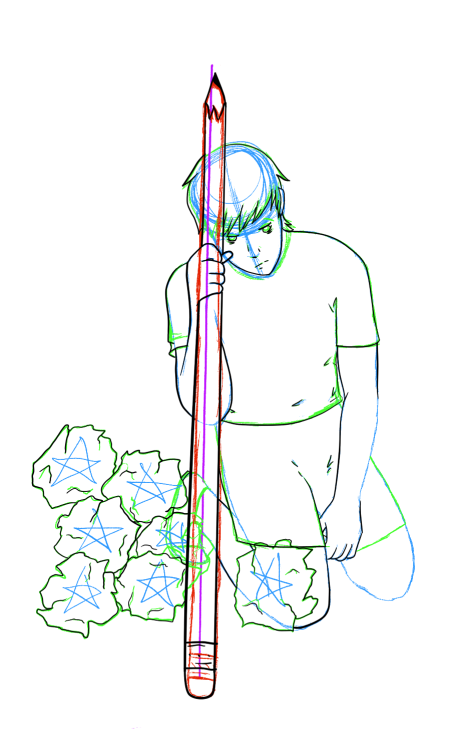 UPDATE: Lines and shading are done! 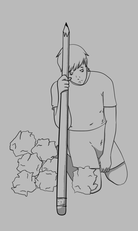 |
|
shadymason
New Member
Last visited dec 8,2019
Posts: 11
|
Post by shadymason on Mar 5, 2014 5:59:51 GMT
UPDATE: Colors! (also still not sure on t-shirt) 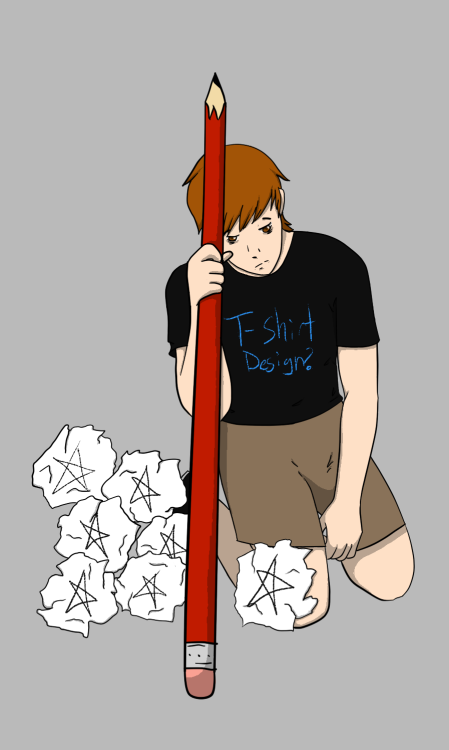 |
|
|
|
Post by thewaywardqueen on Mar 5, 2014 11:34:50 GMT
This is looking really good! I really love the idea of the crumpled paper! For the t-shirt maybe something rwby to make it clear it's Kerry?x
|
|
shadymason
New Member
Last visited dec 8,2019
Posts: 11
|
Post by shadymason on Mar 6, 2014 4:44:06 GMT
UPDATE: Put the beacon logo on the shirt and made the background have the RWBY colors 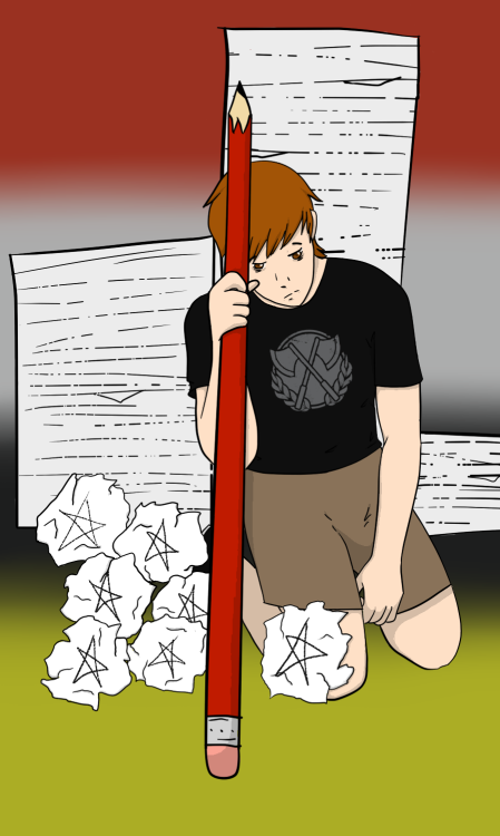 Now I will explain things. In the card the farmer has a tool usually a hoe but since Kerry is a writer I chose a pencil. There are also "mountains" of work to be done and mountains are something commonly seen in this card. I'm not sure if I am completely done. I will take suggestions on what else I can do to make it better. |
|
|
|
Post by thewaywardqueen on Mar 6, 2014 13:35:20 GMT
This is looking gorgous and the logo is really good. Maybe make him a little blonder if you want but other than that i think its great as it is.x
|
|
shadymason
New Member
Last visited dec 8,2019
Posts: 11
|
Post by shadymason on Mar 7, 2014 22:39:30 GMT
Here is the one with lighter hair. Do I need to add text or will you guys do that?  |
|
|
|
Post by thewaywardqueen on Mar 9, 2014 19:00:26 GMT
We're still discussing the font but when we do you'll add it  |
|
|
|
Post by hup123hup123slapslap on Mar 10, 2014 20:50:00 GMT
It looks wonderful, and I'm so in love with your interpretation of the symbolism. Great job!
|
|


